Every year, experts reveal the colors that will influence the following year, after much thoughtful consideration and trend analysis. Here's a round-up of the colors chosen for 2021 by some of the leading influencers in the world of color: Pantone, Benjamin Moore, and Akzo Nobel (Dulux).
Pantone - 17-5104 Ultimate Gray & 13-0647 Illuminating
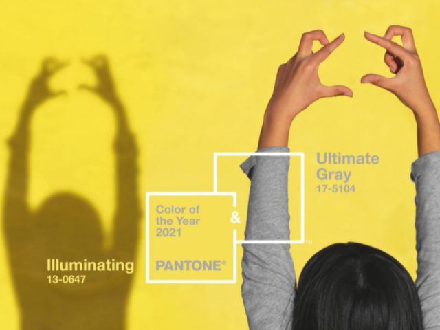
Image source: Pantone
This year, Pantone has broken tradition once again and have revealed two ‘colors of the year’, instead of one. The colors are PANTONE 17-5104 Ultimate Gray and PANTONE 13-0647 Illuminating - a shade of grey and a shade of yellow respectively. The two independent colors were brought together to create an aspirational pairing, conjoining deeper feelings of thoughtfulness with the optimistic promise of a sunshine-filled day.
Since 2000, Pantone has been a globally renowned authority as a color trendsetter and forecaster. The chosen color of the year tends to be widely used through multiple design disciplines such as graphic design, fashion design, branding, packaging, and interiors.
Benjamin Moore - Aegean Teal 2136-40
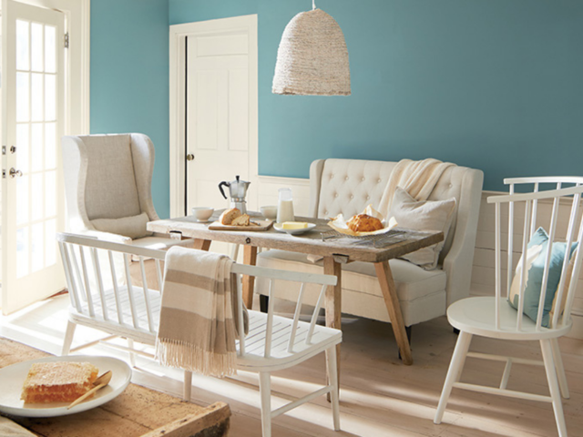
Image source: Benjamin Moore
Take a moment to reflect and reset. Intriguing, balanced, and deeply soothing, the Benjamin Moore Color of the Year 2021, Aegean Teal 2136-40, creates a natural harmony. In addition to the new release, Benjamin Moore has also devised a companion set of color palettes to work in conjunction with this Color of the Year 2021 - "the twelve hues in the palette radiate warmth and wellbeing. These are colors that make your home feel even more like home."
Dulux - Brave Ground
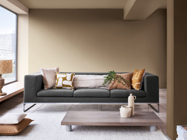
Image source: Dulux
Dulux has unveiled Brave Ground as their color of the year for 2021, a warm, natural neutral, that brings a bolstering, balancing feel to any room. It’s also a versatile shade that lets other colors shine. The inspiration for this color is driven by the creative team based in Akzo Nobel's Global Aesthetic Centre. As part of the process, designers from various industries and design disciplines gather and collaborate over trend forecasting. In addition to Spiced Honey, the company has also released accompanying color palettes of Expressive, Trust, Timeless, and Earth colors.
While these trends will prove to be influential in 2021, the color remains a subjective part of the design process.
Which color do you prefer? Will you be using these in your designs in 2021? Let us know what you think.
The links included here are provided as a convenience and for informational purposes only. We bear no responsibility for the accuracy, legality, or content of any external site or for any content on subsequent websites, nor does the inclusion of these links constitute our endorsement or approval of any products, services, or opinions stated.